Hershey Law wanted to have a website built that was modern & more efficient website than their original website. The previous website included “too many 2D illustrations”, low quality images displaying their practice areas, and an outdated feel that did not match the branding of the firm. Hershey Law wanted a design that would be appealing, high functioning, and would ultimately require less time to maintain. They also wanted the site to feel quick and snappy, while also creating a pleasing user experience.
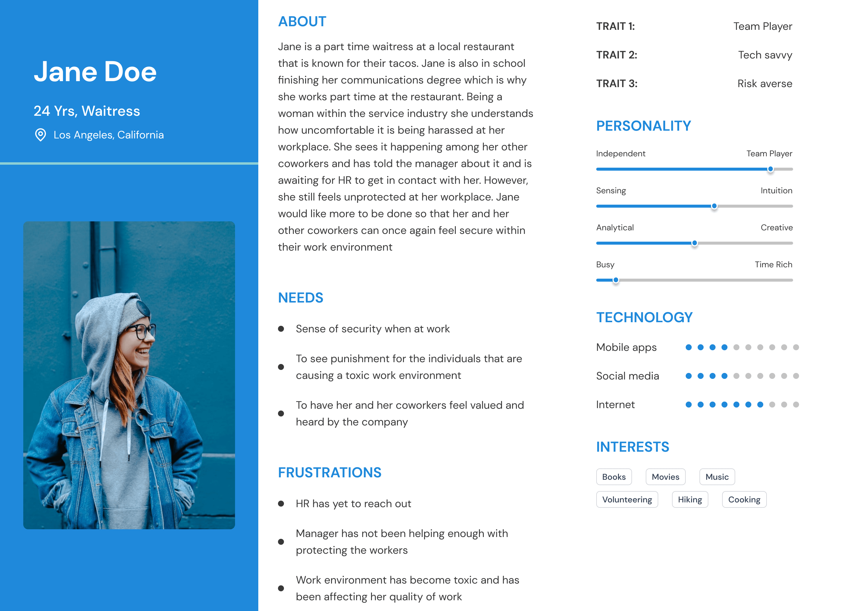
For this project I conducted interviews with 4 different participants in person and online. Along with creating user persona’s to accurately gauge what practices would be most effective in this design. The participants ranged in age from 32-55 years old. I also viewed websites of successful law firms in their surrounding area to see what they may have in common.
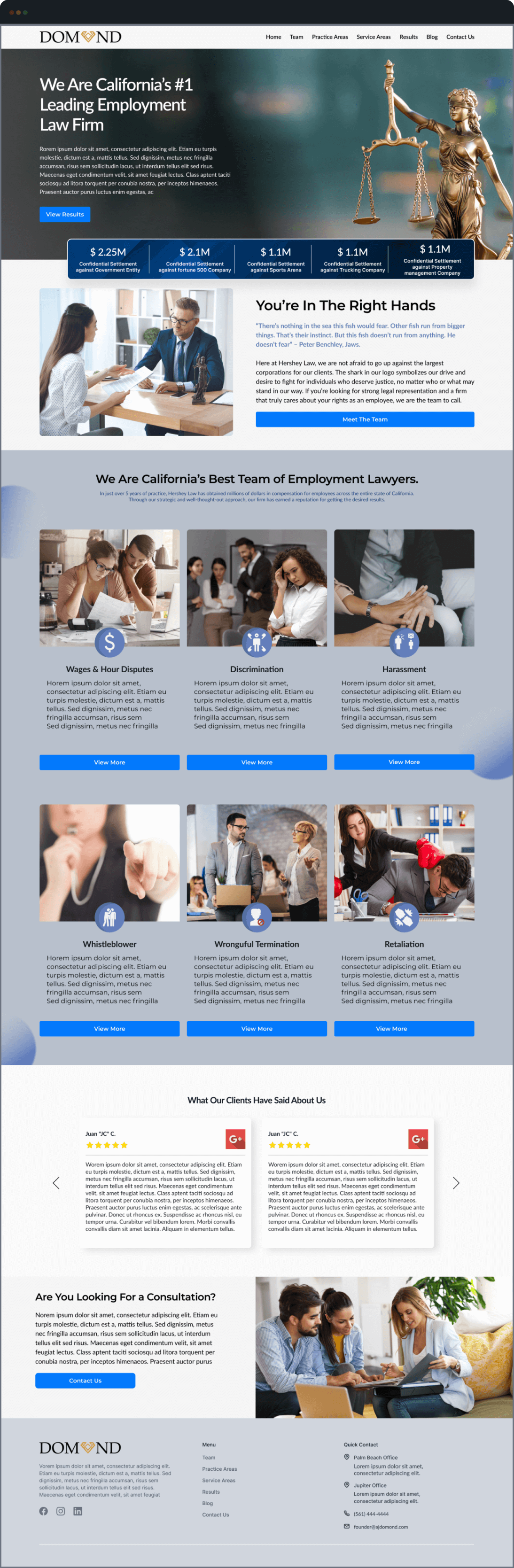
The first thing that was mentioned by both client, and interviewees was that the 2d illustrations were outdated and didn’t fit well with the brands new logo. After discussing the vision of the website, we agreed to steer away from illustrations and instead add more personable elements to the site.
I completed two page insight tests to learn how the website fares in its speed, SEO, and responsiveness scores. After competition of the website I was able to improve the scores for speed, SEO, and responsiveness. The client was also receiving spam emails due to outdated contact forms. I utilized gravity forms and added recapthca to remove the issue of spam email
The company was rebranding itself and wanted to have a website that aligns with their new branding. I was given a guideline of colors to follow to ensure I was staying on brand. It was made clear that they wanted to have a full web redesign with an emphasis of being personable and high class.
Once the initial research phase was completed. I went on to design the first mockup of their home page. The owner and I confirmed that the original design of the website was user centered but was outdated in terms of the styling of the website. They wanted to create a more modern and professional website to accompany the feel of their brand.
Listed below are the key elements I chose to highlight about this design which make it what it is:
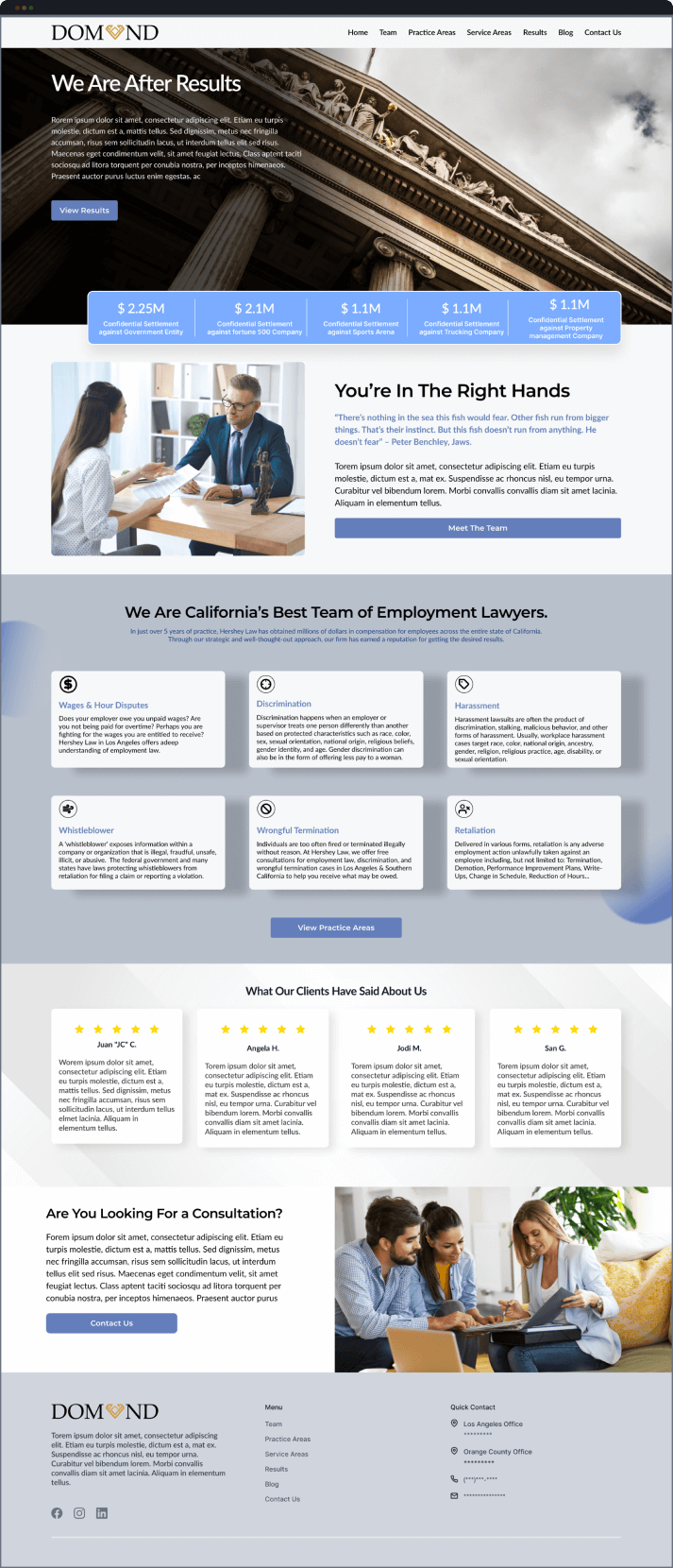
As stated before, my choice of colors were limited as I was given a brand guideline to follow. The percentage of colors utilized followed the 60-30-10 rule. This is a rule that I find to fit best within a 3 color palette design. However, the button colors were put into a vibrant blue which was off brand but was approved. The reason being is because I wanted the buttons to be the focal point in terms of “eye-catching” within the home page to provoke the sense of wanting to view more.
Within the website I featured global CSS animations to continuously keep visitors entertained and engaged. These CSS animations included hover effects on buttons with a change of color, entrance animations on certain elements, and also item highlights within the “we are California’s best team of employment lawyers”.
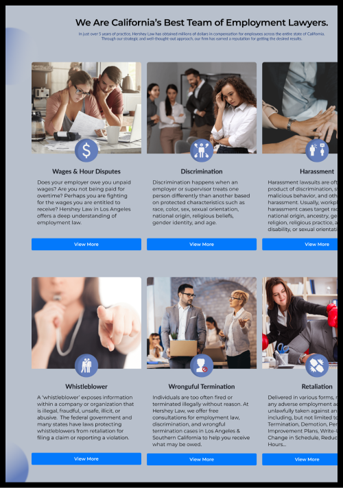
The owner was very stern on creating a more personable website. In doing so, we needed to remove the 2d cartoon illustrations and the large pops of color that filled in the empty white spaces of the site. I replaced them with action invoking images to give a better demonstration of what the company provides for its clients. These images included real people so that it can be easily relatable and securing.
Since this was a well known company that has received multiple verified testimonials, I included the best of them within the site as a carousel. These testimonials helped with credibility and validation within potential users. The reviews also included star ratings.
The CTA buttons were placed to mimic the titles of the sections. I tailored each section to only provide a glimpse of important information to cause users to expand onto other parts of the website that relate best to them. This was so they may complete the ultimate goal of “Scheduling for a free consultation”.
The footer consisted of their logo followed by the company’s mission statement anchored the left of the website. Proceeding on to a quick navigation menu and their forms of contact.
Hover to see me scroll
Utilizing Hotjar and in-person surveys I was able to track what participants were engaging with the most. Along with view the problems they may have in the case that they found the page to be difficult to navigate or complete the ultimate goal. Through the testing I discovered that the users found that the sections from “Your in the right hands” to “What our clients have said about us” was too lengthy without any visual cues. Making the content difficult to focus on and less impactful to users.
Hover to see me scroll
Once I analyzed the results from Hotjar and the in-person surveys. I made the necessary revisions listed below:
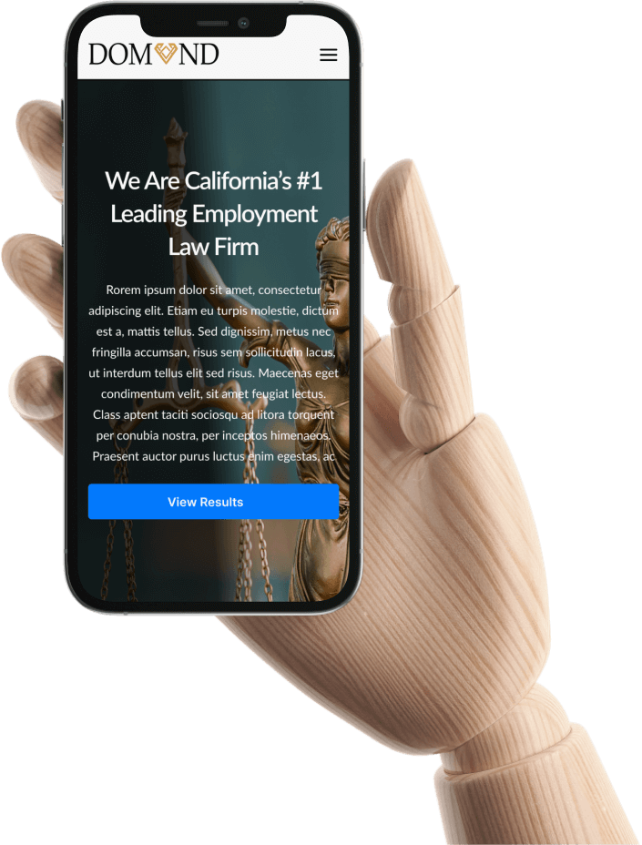
The owner found the original hero image to be too generic to be attached with their brand. I replaced it with this image of lady justice and added an overlay to the image to allow the text to be more visible. I also changed the H1 copy to give a clearer description of the firm.
The original button color was too pale to be used for these action commands. So, I replaced it with a more vibrant blue so it can be a clear focal point within the design.
Within the “floating results bar” I changed the original pale blue to a textured dark blue image and also added a box shadow to the layer. This was to add depth to the layer and create more emphasis on the company’s results.
Now this section was the one that caused for the drop within engagement and was honestly intimidating for users. By adding images and utilizing a different layout approach I was able to increase engagement within this section, and decrease the kick off rate. With this revised layout users were now continuing the customer journey.
The CTA buttons were placed to mimic the titles of the sections. I tailored each section to only provide a glimpse of important information to cause users to expand onto other parts of the website that relate best to them. This was so they may complete the ultimate goal of “Scheduling for a free consultation”.
Montserrat A/reg
Aa Bb Cc Dd Ee Ff Gg
Hh Ii Jj Kk Ll Mm Nn
